


Articles
Health and Wellness UX: the good, the bad and the ugly
The warm up… We’re launching a brand-new monthly series where we uncover what exactly makes, or breaks, a great UX. So, keeping current trends in mind, we’ll be exploring the…

The warm up…
We’re launching a brand-new monthly series where we uncover what exactly makes, or breaks, a great UX. So, keeping current trends in mind, we’ll be exploring the good, the bad and the ugly in the market today. And we’re pooling our expertise from across the UK, US and South Africa to do so. As it’s February and we’re a month into the ‘new year, new me’ period, we’re kicking things off with the health and wellbeing market.
But, before we jump in, let’s first establish: what does the good, the bad and the ugly really mean?
- The good: I’d tell my friends all about it
- The bad: It’s just OK, but has the potential to be so much better
- The ugly: It works, but the experience is poor and it’s a turn-off to continue engaging or revisit
Of course, we need to bring some objectivity to our assessments, so what criteria are we judging these by?
- Ease of use
- Data insights/ analysis
- Community/ social engagement
The good – Down Dog app
The Down Dog app has yogi’s bending over backwards (in more ways than one) to sing its praises, coming out on top in our user experience ranking. Standing out as an example of how to let the customer lead their own journey, we can see its more than just a clean UI which brings the customers back for more.
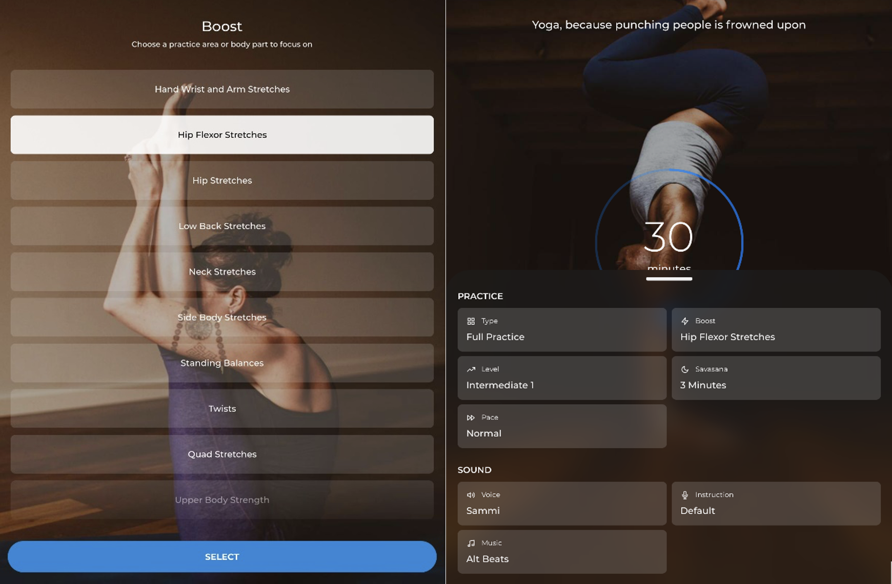
- Ease of use: With a clean, crisp and fully customisable user interface, the app breaks down the technical or confidence limiting barriers to entry. Intuitive navigation puts user preference front and centre and caters to all types of users, from complete beginner to expert.
- Data insights / analysis: Intelligently developing new workout routines, based on previously watched videos, the app is stimulating and fresh. It keeps users engaged, living up to its motto that it’s “yoga for people who get bored easily.” When initially registering, only essential data is gathered, and strictly about practice preferences, meaning users can actually start using the product quickly! Goodbye long sign-ups!
- Community / social engagement: The app allows users to share their workouts on social media platforms at the end of each video, but doesn’t make the broadcast the focus point of the application. Social media community groups have since been set up to share stories, showcasing that if you build a great product, the community will build itself.
The bad – Garmin Connect app
Although it’s the preferred watch for professional cycling teams, runners and triathletes, known for its detailed data gathering, Garmin’s user experience falls behind other brands in this month’s assessment.
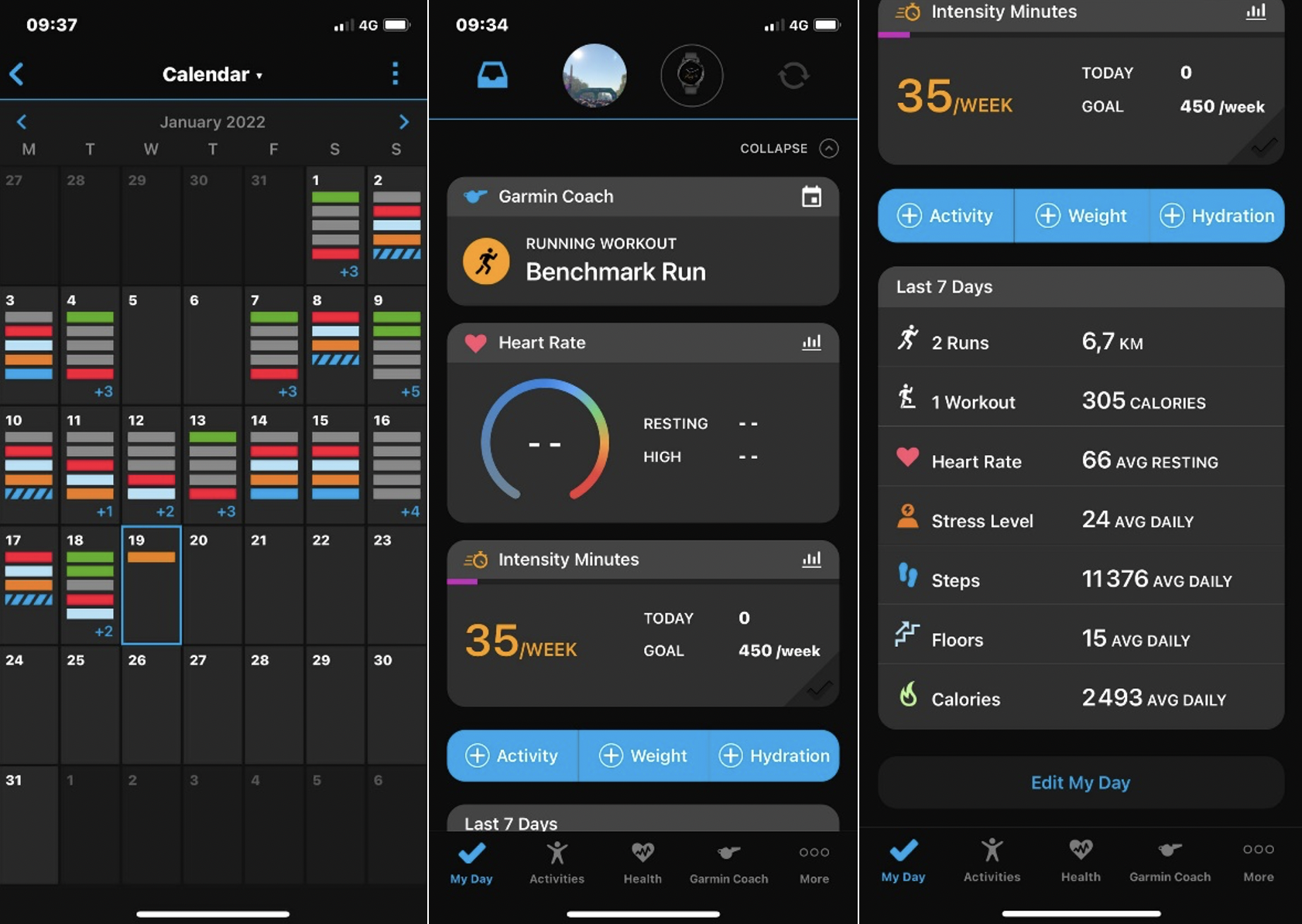
- Ease of use: The app and its features are overly complicated, with a confusing menu and submenu options that make it frustrating to find the right features and importantly, how I use these
- Data insights / analysis: Garmin is preferred by serious athletes for the granularity of data it provides. However, for the everyday user, the analysis of data is a minefield. Day-to-day data is presented in an easy to view format for basic metrics (e.g., heart rate, stress level, steps), but for historic information, a visually busy calendar is displayed. The use of multiple metric categories with varying levels of insights overwhelms the user. It’s easy to say that the product might not be for mass-market, but that’s a disappointing experience for “average joe” when they buy the product due to its strong links to athletes and quickly get’s disengaged
- Community / social engagement: Garmin is behind other brands when it comes to engaging their user community. Although there are options to sync up and ‘compete’ with others, the limited number of users means it is easier to export data to competitors like Strava and engage with a pre-established community.
How to improve
- Simplify the user navigation by learning and solving for the main journey drop-off points for current users.
- Display data in a visually impactful way that helps users to track and monitor their performance over time.
- Motivate users to engage with the app by proactively suggesting tips to improve health and wellbeing based on analysis of health data.
The ugly – NHS and NHS COVID-19 apps
In the UK, the NHS and NHS COVID-19 apps have, unsurprisingly, been used extensively during the pandemic. Although they’re used by many, and seem to function adequately, they are not winning prizes for their appearance or even their functionality and that’s poor when you consider the volume of users.
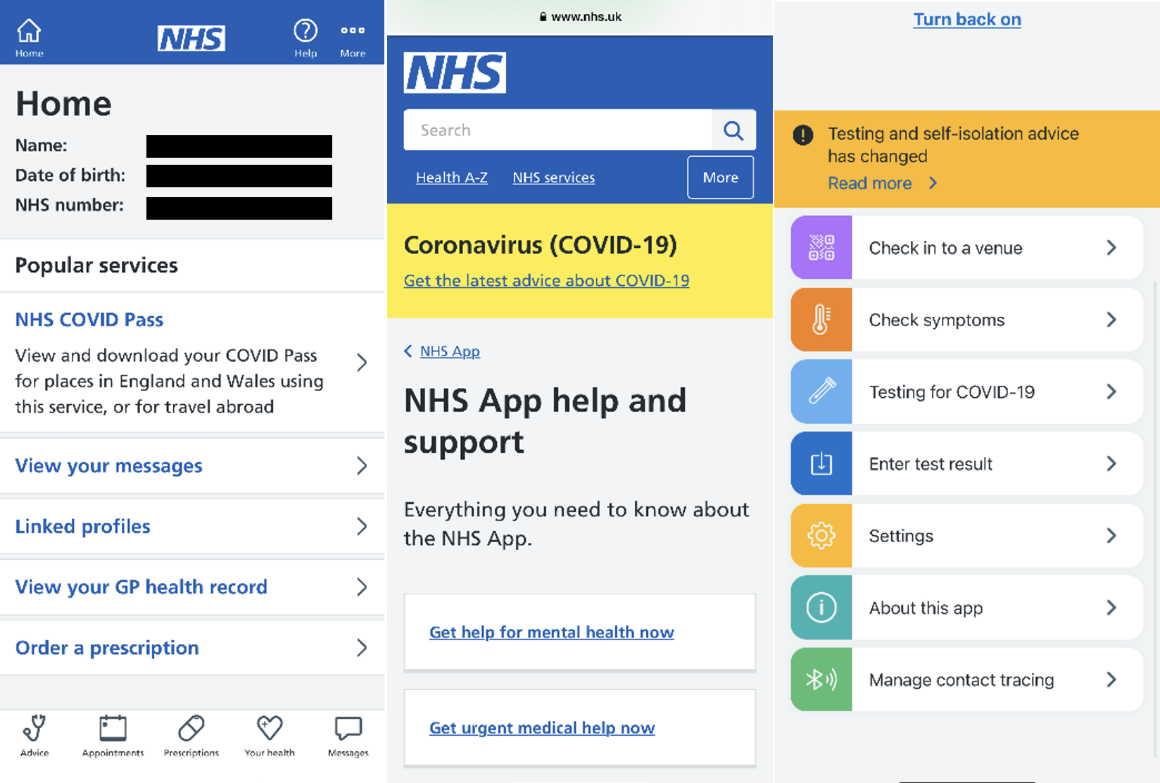
- Ease of use: Firstly, there are two apps that serve very similar purposes, leaving users confused about which app contains which services/information. The apps both have clunky, disjointed user journeys — switching between in-app integration and links out to NHS websites. Additionally, the colours – although functional and synonymous with the institution of the NHS — are cold and impersonal.
- Data insights / analysis / personalisation: The apps are effective at giving access to highly personalised data such as medical records, test results and vaccination passes.
- Data security: We’ve added in an additional criterion for this one. For obvious reasons, when considering private medical data, data security is much more of a contributing factor to user experience. In these apps, users are asked to log in each time they open using biometric and password logins; however, this level of security becomes frustrating when accessing the same items of information each time. Additional touchpoints in the login process add time and often frustration when the information is often immediately required.
- Community / social engagement: As the most publicised way to access your NHS or COVID information, this method excludes members of the public who are unable to access a smartphone, e.g., the elderly or visually impaired. User experience for brands whose primary focus isn’t completely digital (such as primary care) should be wary of focusing engagement efforts in one area. Currently, there are no discernible ways to socialise the NHS applications, however offline enthusiasm for the apps is minimal – not a service to recommend for its features or simplicity.
How to improve:
- Consolidate the app to avoid users having to search across them for the services they’re looking for.
- Consider friendlier tone of voice and palette: Health is an emotive topic that could be supported through a friendlier, more comforting use of colours and tone of voice.
- Gamification opportunities: Many health and wellness apps make learning about your body and your health attractive with interactive engagement opportunities. In turn, these gather more data from users and allow more personalised services as a result. Apps such as Babylon utilise the NHS functionality and have features such as ‘Healthcheck’ to gamify the users view of their body and overall health.
The cool down…
Personal health and wellbeing are just that – personal. The products and services that come out on top bring the exclusive and previously expensive elements of hyper-personalised services to the user for little or no cost. Functionality in this space does not always take precedence over form, as for many people, health is a difficult topic to interact with. So, brands that make connections more difficult and unappealing won’t see the same success as their simplified and visually appealing competitors.
Up next in this series we will take a look at the entertainment market. But for now, connect with our team if you want to supercharge your user’s experience.

You may also like

Articles
Banking on tomorrow: Why regional banks need a digital-first strategy

News
Elixirr partners with Nedbank Gravel Burn to transform the rider experience

Articles
Revolutionising customer onboarding: A deep dive into UX research & design
Articles
Digital transformation for business optimisation

Articles
Customer-centricity: your guide to success

Articles
Customer-centricity: here’s where you’re going wrong

Articles
2023 trends: retail

Articles
Travel UX: the good, the bad and the ugly

Articles
Here’s why the banker should be kept in banking
Articles
Know Your Customer UX: the good, the bad and the ugly

Articles
Wealth Management UX: the good, the bad and the ugly
Articles